One of the newsflies buzzing around today is an article "Brain tumour risk in relation to mobile telephone use: results of the INTERPHONE international case-control study".
The results, shown in this pretty table below, appear to be inconclusive.
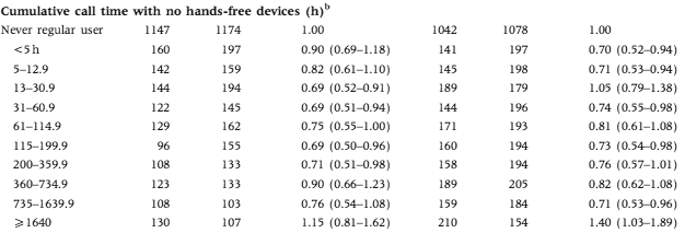
A limited amount of cellphone radiation is good for your brain, but not too much? It's unfortunate that the extremes are truncated. The commentary at Microwave News blames bias:
The problem with selection bias --also called participation bias-- became apparent after the brain tumor risks observed throughout the study were so low as to defy reason. If they reflect reality, they would indicate that cell phones confer immediate protection against tumors. All sides agree that this is extremely unlikely. Further analysis pointed to unanticipated differences between the cases (those with brain tumors) and the controls (the reference group).The second problem concerns how accurately study participants could recall the amount of time and on which side of the head they used their phones. This is called recall bias.
Mobile phones are not the only cause for development and detection of brain tumors. There are lots of factors: age, profession, genetics - all of them affecting the development of tumors. It's too hard to match everyone, but it's a lot easier to study multiple effects at the same time.
We'd see, for example, that healthy younger people at lower risk of brain cancer tend to use mobile phones more, and that older people sick with cancer that might spread to the brain don't need mobile phones. Similar could hold for alcohol consumption (social drinkers tend to be healthy and social, but drinking is an effect, not a cause) and other potential risk factors.
Here's a plot of the relative risk based on cumulative phone usage:
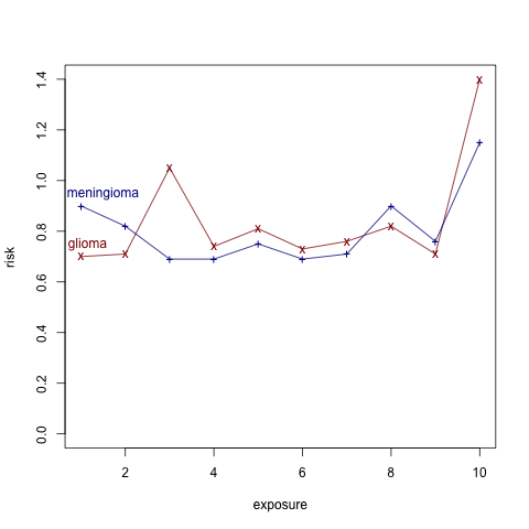
It seems that the top 10% of users has much higher risk. If the data wasn't discretized into just 10 categories, there could be interesting information here, beyond the obvious one that you need to be old and wealthy enough to accumulate 1600 hours of mobile phone usage.
[Changed the title from "many effects" to "many causes" - thanks to a comment by Cyrus]


Aleks, I am not sure I get what you mean by "many effects". It's clear that we want to estimate the causal effect of mobile use, and if anything else is being picked up in the estimate, then aren't we just talking about confounding?
What struck me after reading the abstract for the article was, wow, I don't think an equivalent study would be published in my discipline (political science). What would prevent it from being published is the skepticism that these authors bring to their own results. On the one hand, this is bad for my discipline, because it reflects how publication there usually depends on the significance of the findings, rather than the quality of the design (leading to horrible "file drawer" problems). On the other hand, this looks pretty bad for the authors considered here, because they seem to be bringing post hoc skepticism to bear only (it seems) because the results did not conform to their prior beliefs.
Aleks: I haven't looked at the article, but I can only assume they controlled for age in the original studies.
They matched by age (along with gender, region of residence and ethnicity), but with a wide tolerance of "within 5 years".
It seems to me that a different methodology could give better results than this type of matching.
If the field of statistics has real value to the world it is such as here. Whether there is a signficant negative effect [*] from exposure is greatly important. Laymen cannot interpret this
seemingly murky data.
What's the "answer" that we should act on - for now - as though true? If unknown, then what more is needed to get an answer?
If you say "unknown" and "unclear" then fair enough, though if you are in this camp it would be helpful if you can cite any example of a nonobvious issue - (i.e. where the "answer" wasn't blatantly clear to a smart person who saw the data but had never heard of statistics or probability) - where statistical analysis has aided humanity. Or even - lower threshold - has given a usefully decisive but non-obvious opinion.
-axg
[*] Just to avoid misunderstanding, when I say "significant negative effect" my curiousity is intended to be interpreted as words and meaning within the English language.
Authors and editors should always bring skepticism to their own results!
Because (except for math proofs that aren't fumbled) we are always at risk of being wrong!
Randomization sets a possible upper limit on how often we will be wrong (5%) but without randomization we are always wrong and very often importantly so.
With non-randomized studies no one has really challenged Rubin's advice of matching as closely as possible and then adjusting/modelling as well as one can. Drawing out a causal story in a DAG graph may help (I often find it does) and if one takes that graph serious enough (which I have yet to ever do) some of the matching and adjusting will best not be done.
But I still think its very rare in practice for authors to match as closely as possible and then adjust/model as well as one can.
And its very very rare for a non-randomized study (even an unselected set of non-randomized studies) to ever be very convincing.
I was once involved in one regarding flesh eating disease and the untreated has 70% mortality while the treated 35% mortality. We did all possible linear adjustments (no interactions though) on all available covariates and the adjusted treatment effect was always positive. We argued tentatively that we believed an RCT was not neccessary.
K?
p.s. some may recall a post here years ago about Fisher pointing out that in the original studies on smoking and lung cancer - some of the observed smoking effects were protective ;-)
I understand that this post more concerned with confounding, but I'm trying to get the basics straight.
Consider a null hypothesis like: "after controlling for age and race, cell phone usage ({left, right, both, neither}) is independent of tumor presence and tumor laterality".
What p-value can you report against this?
" It seems that the top 10% of users has much higher risk. "
Is this evident from the plot above?
The original data in the table shows the confidence intervals, which I haven't reproduced in the plot.