Via epc I came across Jonathan Soma's Triptrop NYC, which practically in real time estimates how long it's going to take to travel from a location in NYC by subway to any other location, and paints this graphically as an overlay on a map. Here's Manhattan, starting from Columbia's Statistics Department:
![]()
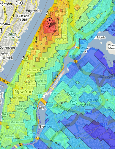
The walking distance is 3mph. Distances in number of minutes are color-coded and above the map. Jonathan says he used SciPy and curve fitting, along with a precalculated database of over 120000 distances between locations.
There are other "time travel" tools for London and UK, but Triptrop NYC is the first one I've come across that allows you to enter your own precise location. As for similar visualizations, here's my post on housing prices in New York.


Cute. Now they just have to put in the bus schedules. Also, I'm assuming these are exected travel times midday weekdays? And, the color code is slightly mislabeled, I think. The numbers (10, 15, etc) should be labeled at the points between the colors, not at the middle, no? (Thus, red is 0-10 minutes, not 10 minutes, orange is 10-15, and so forth, I'm assuming.) Finally, he forgot to color Roosevelt Island. The F train goes there.
I've been trying this for my home and workplace, and its amazingly accurate. It even gets the travel times on the Lexington Avenue subway line (4,5, and 6) right, because the line is overtaxed service is usually much slower than it should be on paper.