Slate has a beautiful animated rendering of the job gains/losses over the past 2 years. It would be very difficult to show the trends without animation.
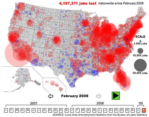
Two other things I like: The quantity circles are so much more informative than using color to paint states: we all know that most job losses are in NY and CA, because they're the biggest! Those circles help control for state population density.
The animation helps control for job gains in the previous period: it hides the cities that are relatively stable, but it nicely shows boom-bust cities (NYC) and stagnation-bust cities (Detroit).
(Via Peter's Twitter.)


Hello, I'm sorry for being off the topic, but I wanted to comment on the Russia's GDP question you posted about a month ago, this one - http://www.stat.columbia.edu/~cook/movabletype/archives/2009/03/what_is_russias.html
I think I know the causes of such big disparities in the data, but to explain them I need to tell a little bit about statistics (the data and the process of gathering it, not the mathematics, of course:) ) in Slavic post-Soviet states (by those I mean Ukraine, Russia and Belarus). There are two major factors distorting the data: first, the good old Soviet tradition of "putting lipstick on a pig" - I don't know if the saying "lies, big lies and statistics" actually originated in the USSR, or if it came from the West, but it was very popular among Soviet executives and specialists who had to work with the data provided by State Statistics Committee (the Soviet statistics agency). This manipulation with data was present on every level of Soviet statistics reporting system - from small factories and shops to large enterprises, ministries and, ultimately, the government. This tradition hasn't died with the Soviet Union and, whenever possible, the data is still manipulated by local and central authorities - this manipulation is, probably, smaller in Ukraine (as the presence of political competition disallows establishing enough control over statistics agency to start really manipulating the data) and larger in Russia and Belarus (as these countries are more authoritarian, hence more control over the statistics agency is possible). Second, the economies of those three countries are "informalized" to different degrees (depending on the level of state presence in the economy and the quality of tax and licensing systems) - with Ukraine being in the lead (relatively low level of state presence and very bad tax and licensing systems), Russia coming second (higher level of state presence and better tax system) and Belarus - third (tax and licensing systems there are even worse than in Ukraine, but with most enterprises being state-owned it doesn't matter that much in terms of "informalization"). To give you an idea of the levels of "informalization" I'm talking about - some estimates put the real number for Ukrainian nominal GDP as 2 or even 3 times the official number.
The distortion of state-provided statistical data by these two factors is immense, which, probably, leads to estimates by international organizations, that are based on different methodologies, being vastly different and ill-corresponding with each other and the official numbers.
Yes, the animation is helpful, but ...
(1) I'm never enamored of graphs that hide data (and don't provide some table so you can find it). Go to the last point (Feb 09) and I defy you to find some counties -- notably Cook County, IL (City of Chicago and nearby), one of the largest counties in the US (both in terms of geographic size and population). In this case, there's no real harm done because Cook has undoubtedly lost some number of jobs as well. But maybe it's done relatively better and has a smaller circle.
(2) I find the notion of blue=good, red=bad offensive, given its association with Dem/Republican politics. I would have preferred green=good, red=bad.
A green/red color assignment is never attractive if it can be avoided, as the most common form of color-blindness would make these colors useless. The anti-aliasing of party identification is a great idea though; why not just black/red, like as in accounting?
Unfortunately, difficulty in distinguishing red and green is a common problem for many people. Green and brown?
I like the color schemes in ColorBrewer - they've paid attention to what's acceptable for different types of media and color blindness.
Aleks, thanks for the ColorBrewer suggestion!
I admit it: proposing red/green was dumb.
If the point is to highlight the hardest-hit areas, I would also find it helpful to see a second version showing the job gains/losses on a per-capita basis. This visualization ultimately only shows population distribution and the rough time period in which an area switches from growth to recession -- but it doesn't really allow you to compare relative degrees of job loss, since higher-population areas will always lose the most jobs in absolute terms. (E.g., maybe ND is harder hit than NY, but you'd never be able to see it here.)