Sometimes people will email me that their comments aren't published on the blog. It's a good idea to be a registered user to prevent this from happening - as we have tens of thousands of spammy messages, and one sees unspeakable things there. So it was interesting to see a visualization (developed by some famous open source developers) of where blog spam comes from:
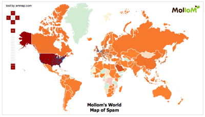
It's a great visualization, except for the colors: the USA is bright red. But what does this tell us? That the USA has the highest number of computers on the World Wide Web, and the total number of blog comments posted? We know that already! The visualization should provide information that isn't known already.
So should one just present the ratio between spammy and hammy comments for each country? That would be valid, but it would involve ad-hoc modeling. Instead, one has to build a model that removes the influence of variables that are already known to influence the outcome, such as the number of computers, the number of all comments posted, and so on. I'll write more about how to do this another day.


Also the map has that awesome Mercator projection, which is just great for mapping trajectories when piloting your ship in the open ocean but otherwise isn't so helpful. Not to mention the goofy bit about Alaska being bright red. It's better than a table, though, I'll give it that.