« Food regulations and natural experiments? | Main | Statistical models and spam »
January 8, 2007
A taxonomy of visualizations
The Visual Literacy project has a wonderful taxonomy of visualizations formatted as a periodic table:
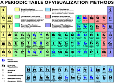
Each type of visualization is described in terms of four multi-level attributes:
- high/low complexity of the visualization ("mass") [updated 1/11/07]
- data/information/concept/strategy/metaphor/compound visualization
- process/structure visualization
- overview/detail/both
- divergent(exploratory) / convergent(summary) thinking
While I find the examples of data visualization quite limited, it is interesting to see how much wider the scope of visualization is.
They also have a taxonomy/directory of visualization scholars.
I've had problems viewing it in Firefox (the pop-ups are empty), but it works fine in IE. I found this on Information Aesthetics.
Posted by Aleks at January 8, 2007 11:16 AM

Trackback Pings
TrackBack URL for this entry:
http://www.stat.columbia.edu/~cook/movabletype/mt-tb.cgi/764
Comments
Ironically, the table itself is not very visually informative. They could have shown a bunch of actual visual examples (e.g. a pie, line, bar chart etc for the same data). And what's the point of arranging it like the periodic table - are these methods increasing in weight somehow?
Posted by: tc at January 8, 2007 10:29 PM.
tc, reading the PDF paper about the partition table, they say the following: Complexity of Visualization: Low to High, referring to the number of rules applied for use and/or the number of interdependences of the elements to be visualized. I have forgotten to include this in my list of attributes.
Posted by: Aleks ![[TypeKey Profile Page]](../assets/877f66dc64771560.gif) at January 11, 2007 12:18 AM.
at January 11, 2007 12:18 AM.